The Story
The name Curavia comes from two Latin roots: cura, care, and via, the way.
A poetic and precise way to express the mission of the medical center: accompany each patient along their care journey, thanks to a treatment plan coordinated by a multidisciplinary team.
waaaw.studio was called in to design a strong and meaningful identity, matching this 360-degree vision of health.
The Challenge
Working in the medical sector requires finding the right balance:
- A reassuring yet modern identity
- Strong symbols but not aggressive
- A professional yet warm image
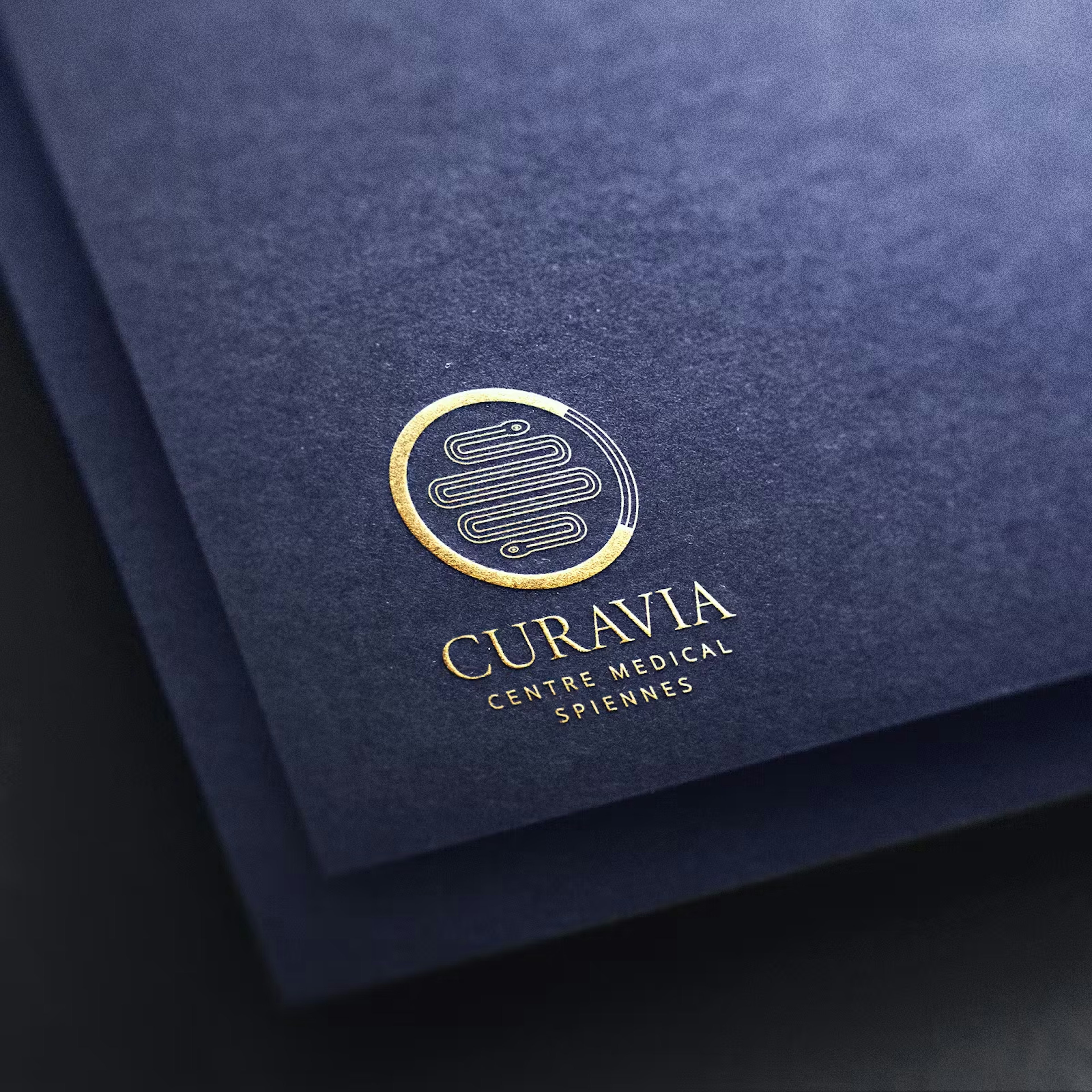
We designed a logo centered on a serpent, the universal emblem of medicine, drawn as a path to symbolize the journey of care.
This serpent is encircled by a “C”, the initial of Curavia, completed by a graphic pattern also found in the serpent’s body, suggesting circular and global care.
Color palette:
- A deep blue, soothing and linked to life, avoiding the overly classic codes of the medical field.
- An elegant gold, suggesting the premium nature of the care.
The result is a coherent, distinctive and meaningful visual universe.
The WAAAW Effect
This project allowed us to work in a more serious sector, with its constraints, its expectations… and its possibilities.
The result: a clear, credible and elegant graphic identity, able to carry the mission of the center across all media (signage, website, medical documents, professional clothing).
A true pleasure to put our creativity at the service of those who take care of others.
Discover their design system
waaaw.studio managed to translate our vision into a strong, legible and sensitive identity. Exactly what was needed to make the center shine.
Bring Your Brand to Life!
We turn your ideas into striking creations — and together, we bring to life experiences that inspire, engage, and stay with your audience.
Start Your Project with Us